FlyHomes is a real-estate brokerage focusing on helping customers find their dream home.
Previously, existing customers have tried to use the online search tool but found it “too complicated to manage” and “...have to rely on the Client Advisor to simply schedule a tour”. And this compiled customer feedback goes on in regards to using our website. In addition, new online customer engagement and acquisition was very low.
The project's success was tied to identifying and delivering on the core business objectives and user’s needs. Using the website the success criteria would be measured using key metrics around user engagement and sign-up, tour scheduling and offer drafting request features. This would have the targeted benefit of reducing direct phone support inquiries and allowing the team to better manage multiple customers on a timely basis (metrics to be captured subsequently).
This project is a part of a larger integrated solution for helping the business manage a home-buying journey life-cycle.
Solution: A redesign of the existing Search expereience. Applying core UX principals to better organize content, deliver clearer navigation structure with a discoverable interaction flow and intuitive visual language that is measurable.

User research
I created a research plan to identify the key questions we needed to answer and collect evidence to support recommendations. In collecting evidence, we conducted surveys with the internal team and with around 30 customers, interviewing several in depth over the phone; as well as auditing the existing user experience and analyzing how other products solve similar problems.
This is a key part in deliverying a solid Design Strategy for effectively addressing both the business objectives + the users’ needs and to progressively evaluate our decisions in the process.
DESIGN STRATEGY
-
Customer account sign-up.
-
Fast and easy Tour scheduling.
-
Intuitive navigation and UI in the search process
-
Easier tour scheduling.
-
Have more control over their search results
-
Collaborate and share house searches with others.
User needs + Business objectives
Surveyed key stakeholders to learn the core business objectives. Survey feedback from both exisiting and former customers to learn what needs were missing for users. Utilized site data collection and internal notes.
Navigation Map and variable logic
Core Principal: Good Information Architecture (IA) allows for moving through content efficiently and effectively.

We audited existing application task flows
To help identify existing opportunities we focused on primary task flows with the existing search site. Additional focus on interface design and messaging details, alternate states, and narrowing scope options for the user. We worked with engineering to develop a UI pattern library to improve efficiciency in alignment on reuse and flexibility.
-
Feature refinement based on feasibility
-
Finalize UI pattern library
Lightweight journey-mapping
I mapped out success journey paths for searching based on the user stories we'd explored with the team. This helped us prioritize the features by value and feasibility. We further prioritized which options to ship with the initial MVP launch and which to revisit after gathering active customer data.
Sketching
I organised an iterative workshop with designers and a product manager to generate ideas. We used crazy-eights and dot-voting and came away with a handful of strong ideas to explore. Over the following days, I created a light-weight user journey document and mid-fidelity clickable wireframes (using Sketch and Framer) based on our ideas. We pared the features down to deliver a solid MVP based on our Design Strategy. Iteration was continual over the wireframes until everyone felt confident in the content and interaction design to bump up the visual fidelity.
Each page, global element, and user story had an important product focus and unique set of design challenges. We worked through interaction details, desired functionality and alternate states quickly, looking for proximity patterns and opportunities to stream-line cognitive-load on our customers and to simplify technical changees for our engineering partners.
Product design patterns included:
-
Navigation UI
-
Search element components
-
Map and filtering interactions
-
Alternate states
-
and many more
IxD: essential principles
-
Consistent: Navigation & hierarchy
-
Visible: Discoverability
-
Learnable: Intuitive (single-trial learning)
-
Predictable: Accuracy. Can user pass the “trunk test"
-
Feedback (UI): Promotes learning


IxD to support visual design flow
Planning visual emphasis in element hierarchy and UI organization
Prototyping complex UI interactions
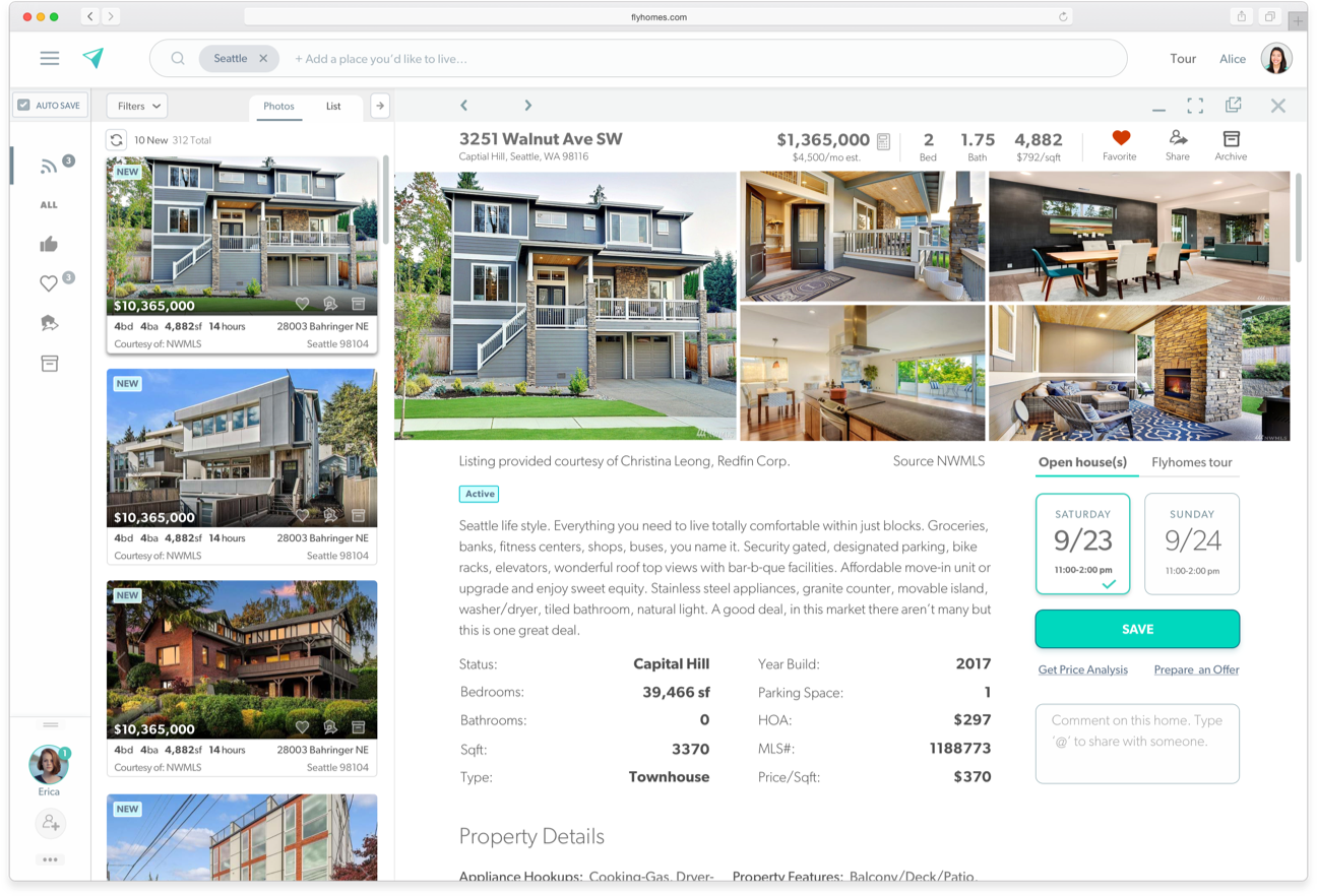
A challenge was presented for maintaining prominent UI placement of the Tour Module within the house listing content layout design--key design strategy feature--within a scrollable responsive layout.


Common UI patterns
This system needed to support multiple projects (desktop/mobile platforms). This was an evolving system.

Old Design

Contrast the Tour Module: Setting UI hierarchy

Continually evaluation of goals set by the Design Strategy, it was core to highlight the core features: Tours, offer drafting and comparision analysis requests. Goal: using color, content proximity and grouping eye key content stands out to the user. Establishing familiarity.
New Design
The Outcome
Learnings: Post implementation new features were introduced (e.g. Feed list). While some features were ommitted (e.g. Collaboration). The results of these may have been correllated to aggressive schedule and lack of product back log.
Sentiment about the design and UX framework was very positive, but the product had a slow and fairly buggy rollout. It would take a couple releases to stabilize into a reliable product.
One very positive outcome of this project was greater emphasis on collaboration between silos and acceptance of a more Lean UX approach.
Key results from strategy:
-
User account sign-up rate: saw a 300% boost in the first quarter from previous and maintains a ~30% growth (month over month) growth.
-
Retention: how often a desirable action is taken (e.g. Schedule Tour) on the site. 48% consistent boost in the number of scheduled tours—direct correllation to user sign-ups.
-
Net Promoter Score: customer satisfaction measured through their willingness to recommend the service to others. Measured via direct feedback surveys.